@zzd10h, mattew
Something wrong with XDock's transparency.
Check this out screenshot:
(press RMB and choice open image in new tab):

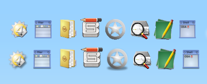
First bar, it is XDOCK, second one is AmiDock. In botch, i have set 48x48 for icon.
You can see, that in AmiDock it looks "clean". There is "shadow" keepts in place, and all the border lines are smooth. While in XDOCK, shadow disappear completely (see first icon from dopus4, and 5st icon of Ranger). Also see MultiEdit icon, you can see that in some part (left/top) it even "eat" some pixels. Or for example WorkbenchExplorer icon, at the bottom very vissibly how good it looks like in AmiDock, and how different in XDock. Or pencil in the sketchblock icon.
For better visiblity just expand size of window to have closer look. I upload/save it as PNG so no loosing of quality and all should looks as it.
All of this point out that in XDOCK transparency algo is some simple one, which make quality of icons bad, while in AmiDock, it looks clean and didn't eat shadows, etc.
If that can be fixed, that will be pretty good :)

 Donate


